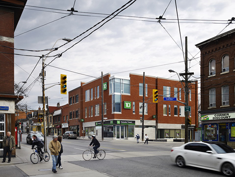
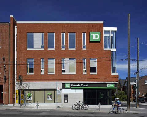
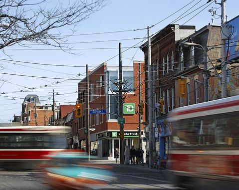
The site is a prominent corner on an old commercial street. The building aims to be a "good neighbour" in a contemporary way.
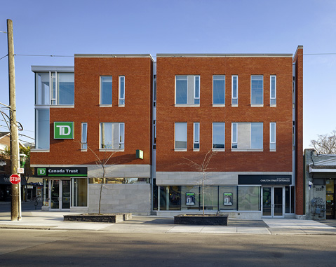
In scale with its surroundings, red brick-clad, tight to the street, it has punched windows, walls more solid than void, a vertical emphasis to openings, stone details, and a glassy main floor. A prominent, glazed corner "lantern" acknowledges the main intersection diagonally opposite—a counterpoint to the old hotel tower at the other end of the block. Unlike buildings on the other corners, both elevations are treated as "fronts". A reveal scales down the Carlton face into two smaller "buildings". The heterogeneity of its surroundings are summed in its layered, even "picturesque", facade composition.
Stone-clad planter benches were coordinated with the BIA, establishing a modest, neighbourhood meeting place.
A bank occupies the first and part of the second floors, the rest, office space.


